
As LPEA approaches its 85th anniversary this October, the cooperative proudly unveils a new commemorative logo that captures its rich history while looking ahead to a bright future. This milestone reflects LPEA’s steadfast commitment to delivering power and progress to the rural communities of Southwest Colorado.
"The establishment of LPEA was not merely about electrifying rural homes," stated Graham Smith, LPEA's Interim CEO. "It was a bold declaration of self-reliance and community collaboration. The new logo embodies the spirit of the membership, weaving together its heritage and narrative into every element."
A Legacy of Resilience and Innovation
Founded in 1939 amid a landscape largely devoid of electricity, LPEA was born from the determination of local farmers and ranchers to illuminate their communities. This cooperative spirit mirrors the broader narrative of electric cooperatives across the nation. As this anniversary is celebrated, LPEA reaffirms its commitment to community-driven solutions and self- sufficiency.
Honoring the Roots
The special logo is inspired by a 1950s photograph of a Pagosa Springs manager beside a delivery vehicle, forging a connection between the past and present. This imagery serves as a foundation for the logo design, symbolizing the journey and the collective progress made as a cooperative.
Visual Identity
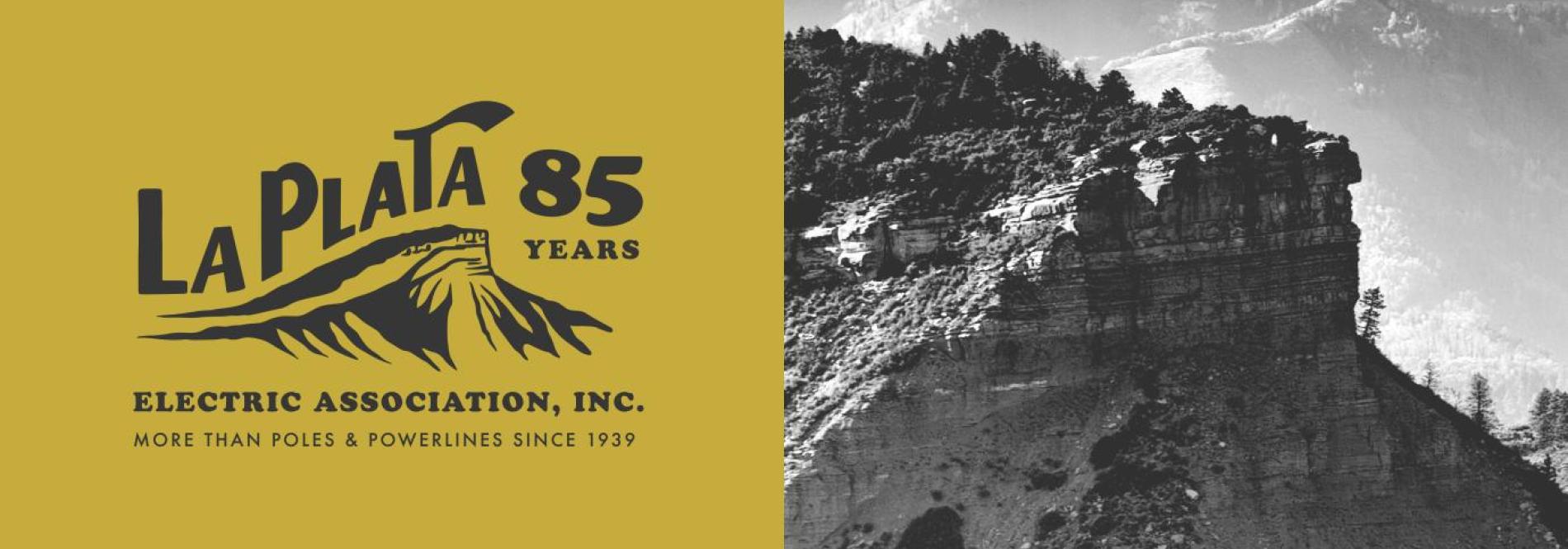
The commemorative logo features "La Plata" in bold script, reminiscent of the original vehicle branding, alongside a depiction of Perins Peak—reflecting deep roots within the community. Available in two versions, the anniversary edition prominently showcases "85 years," while the standard version incorporates a sunflower, symbolizing both the beauty of the region and LPEA's commitment to sustainability.
A Meaningful Tagline
The tagline, “More Than Poles & Powerlines Since 1939,” encapsulates LPEA’s essence. It signifies the organization’s role as more than just an electric utility; it represents a community united in cooperation, illuminating the spirit that has defined LPEA for over eight decades. A
Timeless Design
The color palette and typography of the new logo draw inspiration from the natural beauty of Southwest Colorado. Colors such as "Grounded Forest" and "Sunbeam Gold" evoke nostalgia while appealing to modern sensibilities. The typography—featuring a hand-lettered "La Plata" and classic typefaces from the 1920s—connects the enduring presence of LPEA to its rich history.
Looking Forward
As LPEA reflects on its past, it remains committed to a sustainable future, aiming to reduce its carbon footprint by 50% by 2030. Initiatives like the Sunnyside Community Solar Program illustrate LPEA's dedication to innovative energy solutions, ensuring that it remains a trusted partner for generations to come.
The new logo represents not just a visual mark, but a celebration of LPEA’s heritage and a beacon for its future. As the cooperative moves forward, it continues to embody the spirit of innovation and community commitment that has guided it for the past 85 years.
Read more about how we're celebrating 85 years and the process behind the logo here. Stay posted in October with a series of events in honor of National Coop Month.